

Case Study: Modernizing Phillips & King’s Buyers’ Guide
Phillips & King is a leading distributor specializing in importing cigars, tobacco-related products,
and cannabis paraphernalia for sale to various retail outlets including smoke shops, cigar shops,
liquor stores, and head shops. With a diverse range of products including humidors, lighters, pipes,
grinders, glassware, and vape devices, the company has established itself as a go-to source for
retailers seeking quality merchandise in the tobacco and cannabis industry.

Challenge:
As the market evolves and consumer preferences shift, Phillips & King recognized the need to revamp their brand, and by extension their monthly buyers’ guide, to stay relevant and competitive. The existing design felt outdated, cluttered, and lacked clarity, making it challenging for retailers to quickly find promotions and understand product offerings. The goal was to modernize the magazine’s aesthetic while enhancing readability, navigation, and promotional visibility.
Approach:
The redesign initiative began with a comprehensive analysis of the current magazine layout, identifying pain points and areas for improvement. Answering directly to the vice presidents of sales, purchasing, and marketing, as well as the president of the company, I established key objectives for the redesign:
Modernization: Infuse the magazine with a fresh, contemporary look that aligns with the company's recently revamped brand identity and better target an evolving customer base.
Readability: Enhance legibility through strategic typography choices, improved spacing, and clear hierarchy.
Navigation: Streamline the layout to facilitate easier browsing and navigation, enabling retailers to quickly locate relevant sections and promotions.
Promotion Visibility: Implement visual cues and design elements to highlight promotions, special offers, and new products, making them more prominent and accessible.

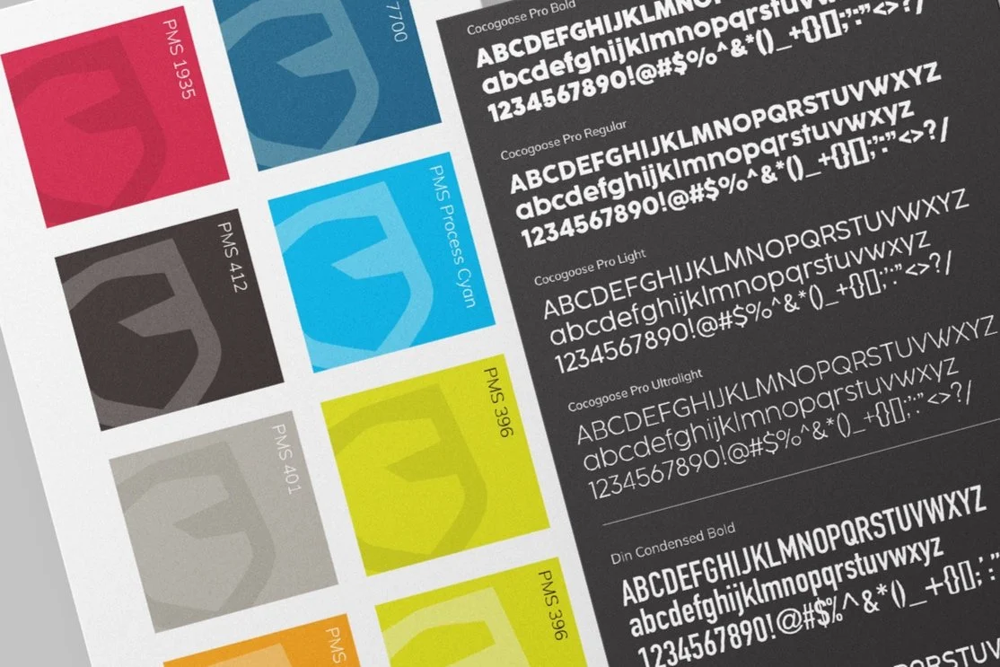
To improve readability, the typography underwent a meticulous overhaul, with attention paid to font size and spacing.
The division between information and imagery was removed to allow for more flexibility with the amount of copy.
More dynamic photography was selected to convey the brand identity of the products being showcased.
Clearer headers were introduced to guide readers through the magazine seamlessly.
Promotions were given prominence through eye-catching call-outs, strategically placed throughout the magazine.
Vibrant imagery and concise copy were utilized to communicate the value propositions effectively.
Extraneous elements were removed to avoid distracting readers.
Before

After


After
Execution:
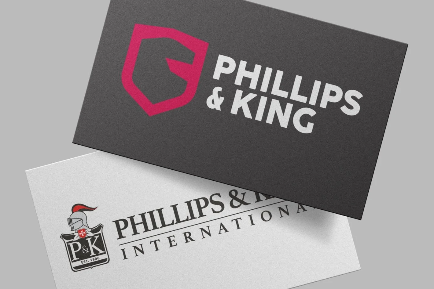
The redesign process commenced based on the newly developed logo for Phillips & King, serving as the cornerstone of the brand refresh. Complemented by carefully selected fonts and a vibrant color palette inspired by the company's product range, I crafted a cohesive visual language to unify the magazine's aesthetic.
Before
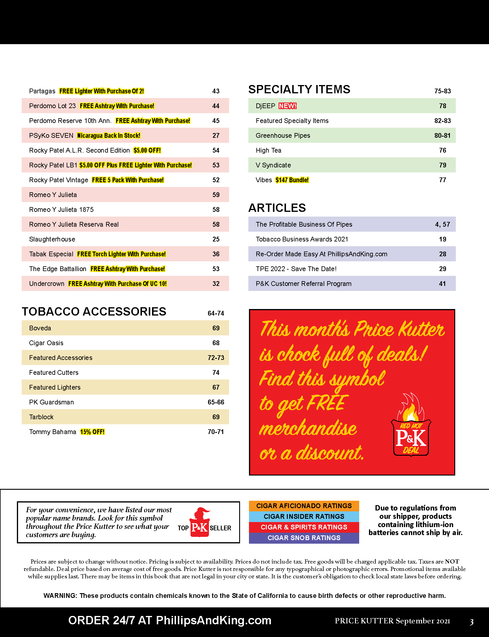
Navigation was simplified by reorganizing the table of contents into logical sections, consolidating the information onto one page, and better incorporating intuitive visual cues, such as color-coded section dividers. A reader-friendly color key was added to aid quick reference by highlighting page numbers that contain promotions, new products, award-winners, exclusive items, limited editions, and top sellers.
The use of red and the shield shape throughout the magazine to indicate promotions reinforce the new branding and make it synonymous with value.

Results:
The revamped Phillips & King magazine received overwhelmingly positive feedback from retailers and stakeholders alike. The modernized look and feel resonated with the target audience, enhancing the brand's perception as a forward-thinking industry leader.
Key metrics, including engagement and conversion rates, showed significant improvement following the redesign, indicating enhanced reader satisfaction and a more effective promotional strategy.
Furthermore, the design elements and assets developed for the magazine were seamlessly integrated into other marketing channels, including email campaigns and digital banners on the company's e-commerce website, ensuring a consistent brand experience across touchpoints.
In conclusion, the magazine redesign not only fulfilled the initial objectives of modernization and improved readability but also set the foundation for future marketing initiatives, reaffirming Phillips & King's position as a trailblazer in the distribution industry.